Joint presence
The Goetheanum as the School, building and home of the Anthroposophical Society lives in many initiatives, working contexts and Sections. In June a new logo has been released to give these various entities a joint presence (Anthroposophy Worldwide, 7-8/2020).
Thirty-five different logos are used by the Goetheanum initiatives and institutes. This kind of diversity is an inherent quality of our cultural work. And yet, each logo needs to be recognizable and, if so many stories are told, there is a danger that the big story may no longer be heard. Just over a year ago, the Goetheanum Leadership decided to strengthen the joint identity of all these individual entities by introducing a common logo. Wherever they present themselves publicly, from websites to stage posters, they can now use one easily identifiable symbol.
Why a logo?
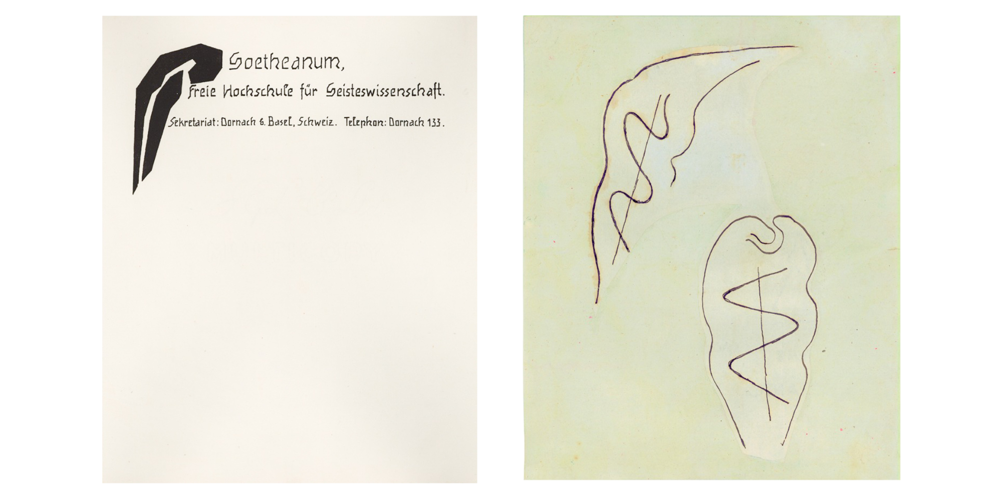
The “School Logo” designed by Rudolf Steiner in 1924 for the Goetheanum letterhead is of course an obvious choice. Presented at the height of his second phase of graphic creativity, it follows the simple lines he designed in 1917 for the movement for social renewal. This symbol belongs to the ‘new initials’ – inspirational drawings that can be found to the left of anthroposophical titles and texts. They bring a certain dynamic to the rectangular printing format, opening the book or page with a preverbal intention. The School Logo reflects the new beginning that was dawning at that time, and the second building, then still in the process of being born.
The versatile use and reproduction of the symbol make it more similar to what is today known as a logo. Up until the 1980s it was natural that individual projects designed their own forms and gestures in order to identify as anthroposophical. Today’s expectations of a universal brand are different. Historically, symbols (heraldic signs, shields, seals etc.) tend to have a resting centre that emphasizes an enterprise’s central, self-relating ‘I’, or essence. In the School Logo, on the other hand, the centre is on the outside, protecting what it embraces.
For Weleda, Rudolf Steiner proposed various symbols that could identify the company brand and function. The difference between an opening and a sealing, an address and a sender plays an important part. What is interesting in our context is the transformation of a sign: from an opening gesture to a resting one (see illustration). Precisely this quality is essential for the way we use logos today: in random places on the page or screen, unrelated to other elements of writing or imagery, very small or dynamically large. This unfocused usage has increasingly resulted in the logo becoming distorted or stunted – its gesture reduced to a memory.
We realized that Steiner’s design needs to be used in a more dignified way in the future: in appropriate formats and preferably for inspirational work. It will continue to form part of the letterheads of all Sections.
Implications
In order to strengthen our joint presence and accentuate connections, a new symbol ‘wanted’ to be created; a symbol that can meet today’s requirements, from social media icon to minute cooperative logo.
Finding the new logo has taken more than a year. In various working contexts, people designed and discarded until a condensation of intentions became visible: the building should be recognizable but not trivialized; the symbol should be compatible with the School Logo, reflecting organic movement rather than crystallized geometry. The image that has emerged shows the characteristic gesture of the Goetheanum building: upward-striving, rhythm, subtle transformation; three stages, a play of forms that mediates between above and below, between distance and proximity. This final design has been gradually introduced since the summer.
Stefan Hasler (Goetheanum Leadership), Philipp Tok (Graphics)